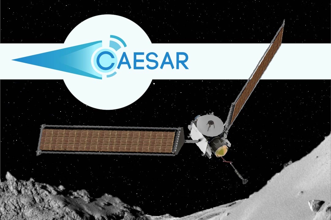
After being a fake astronaut, a time-traveling scientist, and an anti-futurist, my obsession with science fiction has finally put me in league with actual space-faring NASA scientists. For the past two years I've been doing occasional design work for a NASA mission proposal called CAESAR—for Comet Astrobiology Exploration SAmple Return (yes, apparently now you can use two letters of a word for an acronym).
The proposal is one of two finalists for upcoming missions, and it's organized by an international team of scientists and engineers. Throughout the first round of the competition, most of the information about CAESAR was kept under wraps, but the public website I developed for the project is finally live, so the curtain has been lifted on some of the work I've done for the project.
It's exciting that the folks leading this project recognize the importance of graphic design and digital media, and I've greatly enjoyed my look into the development of the space-faring comet-grabbing robot named CAESAR.
Having worked with science students at Johns Hopkins and Penn State, I'm familiar with the tragicomic design scientists create for conference posters and publication. I teach occasional workshops about poster design, and try to equip young scientists with basic design skills and software know-how, but for larger projects like CAESAR it's probably wise for the team to bring in a hired hun like me to develop the branding identity for the suite of figures and publications involved in the ongoing project.
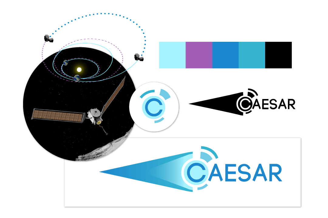
The CAESAR logo shows a stylized comet breaking apart into concentric circles, in reference to the mission's objective of bringing home a piece of Churyumov-Gerasimenko. It also resembles the blue-tinged ion drive that will power the ship on its 14 year journey.
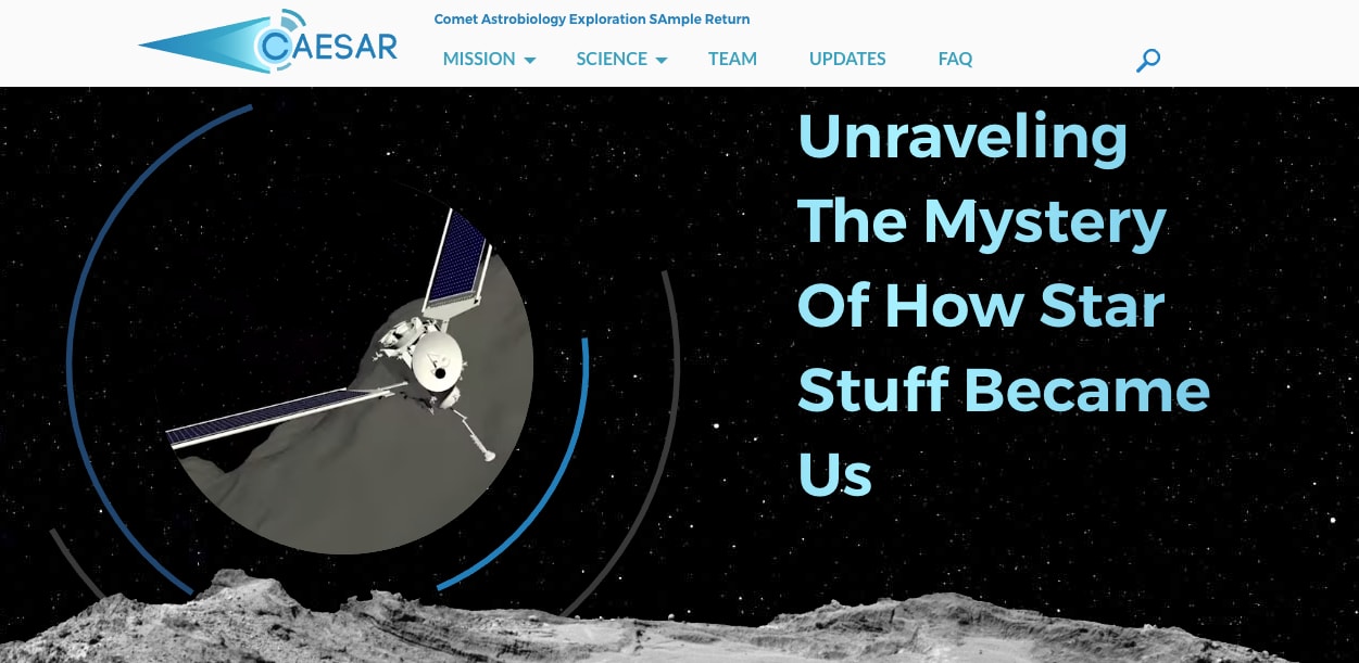
The website uses a dark theme (because space) to create a bit of drama in the presentation of scientific details. The page headers and some design elements on the home page use circles to echo the concentric rings of the logo—and the ellipses of the mission's trajectory, which I think a terrific graphic element.
The top section of the home page uses some fun CSS effects to create the rotating rings and dynamic text. The rings are just SVG's set to rotate with CSS animations, and the video is simply cropped with border-radius!
The shadowy header text is a little more complicated, but I made a CodePen that demos the technique.
See the Pen Animated Shadow Text by Benjamin Andrew (@BenFictional) on CodePen.
The text's container element is set to background-clip: text and then I created a gradient background element that's much larger than the actual element, and animated it with CSS. The enormous gradient just needs to begin and end with black so it can loop seamlessly.