As a parent of two small children and a professor of art and design, I’ve developed a lot of opinions about children’s books in recent years. To help students and other burgeoning illustrators develop their book ideas, I pulled a bunch of favorite titles off the shelf to walk through one of the first steps to designing a book: page layouts.
Assuming you have a story idea and some preliminary character sketches, the first step to making a book is to figure out your page layouts and how you’ll integrate text and illustrations.
Start with simple thumbnail sketches, like these from Marla Frazee:
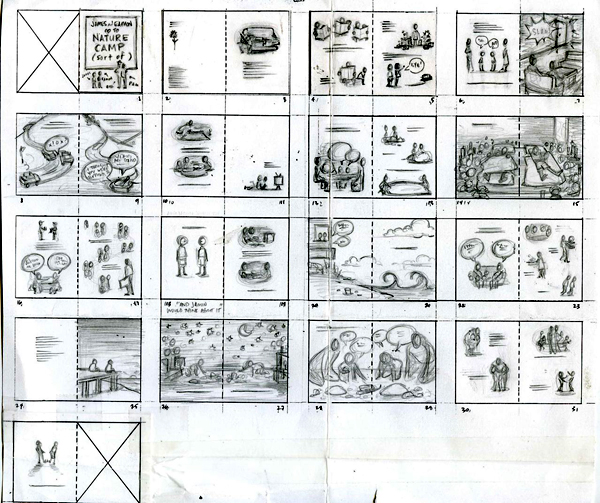
Note the variety of page layouts, from full-bleed illustrations, to isolated characters, to text-only. It’s important to consider pages as pairs in a two-page spread because that’s how readers will see them, and the combination or contrast of those two pages can be a tool for communicating emotion and story beats through visual design.
When beginning your own page layouts, decide on an aspect ratio (width × height).
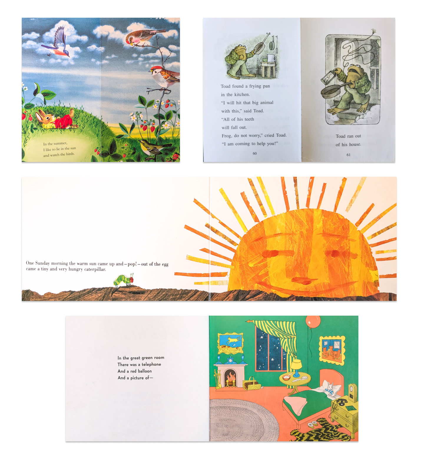
Note the range of aspect ratios, from very tall to very wide. As kids begin to read for themselves, I think the aspect ratio of books sticks to something approaching a typical adult novel (e.g. Frog and Toad at top-right).
Many children’s books feature generous amounts of white-space, or paper without any color or ink printed on it. I suspect there are two main reasons for this:
- Cost-saving: Less ink keeps down the cost-per-book, though this is less true today with more advanced and large-scale printing technology.
- Visual Clarity: Isolating characters against areas of negative space can help young readers focus on their actions and emotions, without distracting background details.
But you can find plenty of books that break this convention through the use of visually intricate full-bleed artwork. But then, how to integrate text with such busy imagery? One solution is two have text on a separate page entirely:
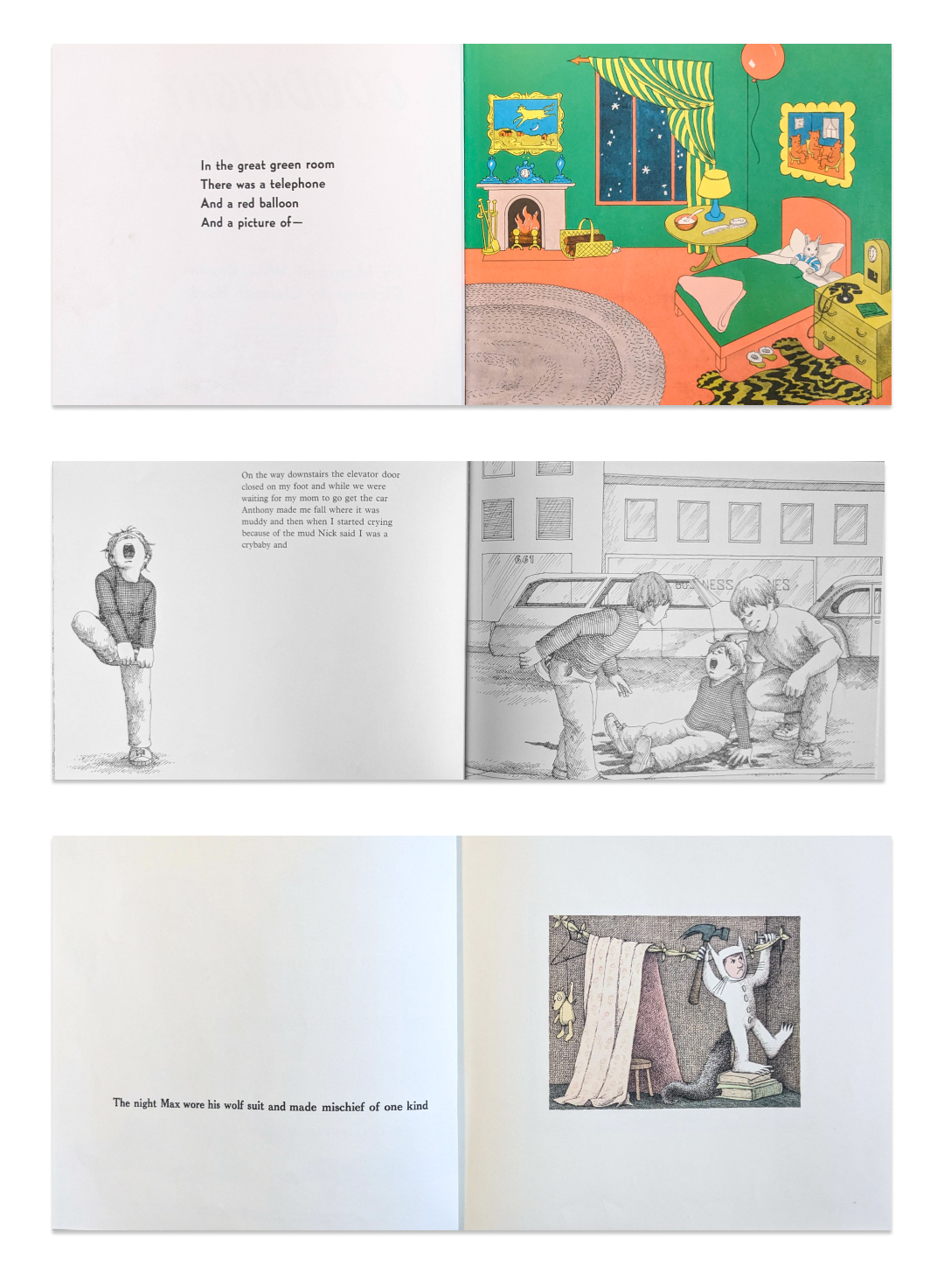
In the middle image above (Alexander and the Terrible, Horrible, No Good, Very Bad Day), illustrator Ray Cruz has included an isolated character on the “blank” page for added interest.
But if you follow the same page layout on every spread, your book will feel repetitive and you’ll lose the ability to direct focus and emphasis with varied layouts. Recalling Marla Frazze’s thumbnail sketches above, varying page layouts is akin to how filmmakers use framing and varied lenses to control how “close” or “distant” we feel to the characters, as well as using visual composition as part of the storytelling or thematic symbolism.
The other design challenge of picture books is deciding where to place text and how to keep it legible. Besides leaving entire pages blank, illustrations can be placed inside of bubbles or frames of varied shapes:
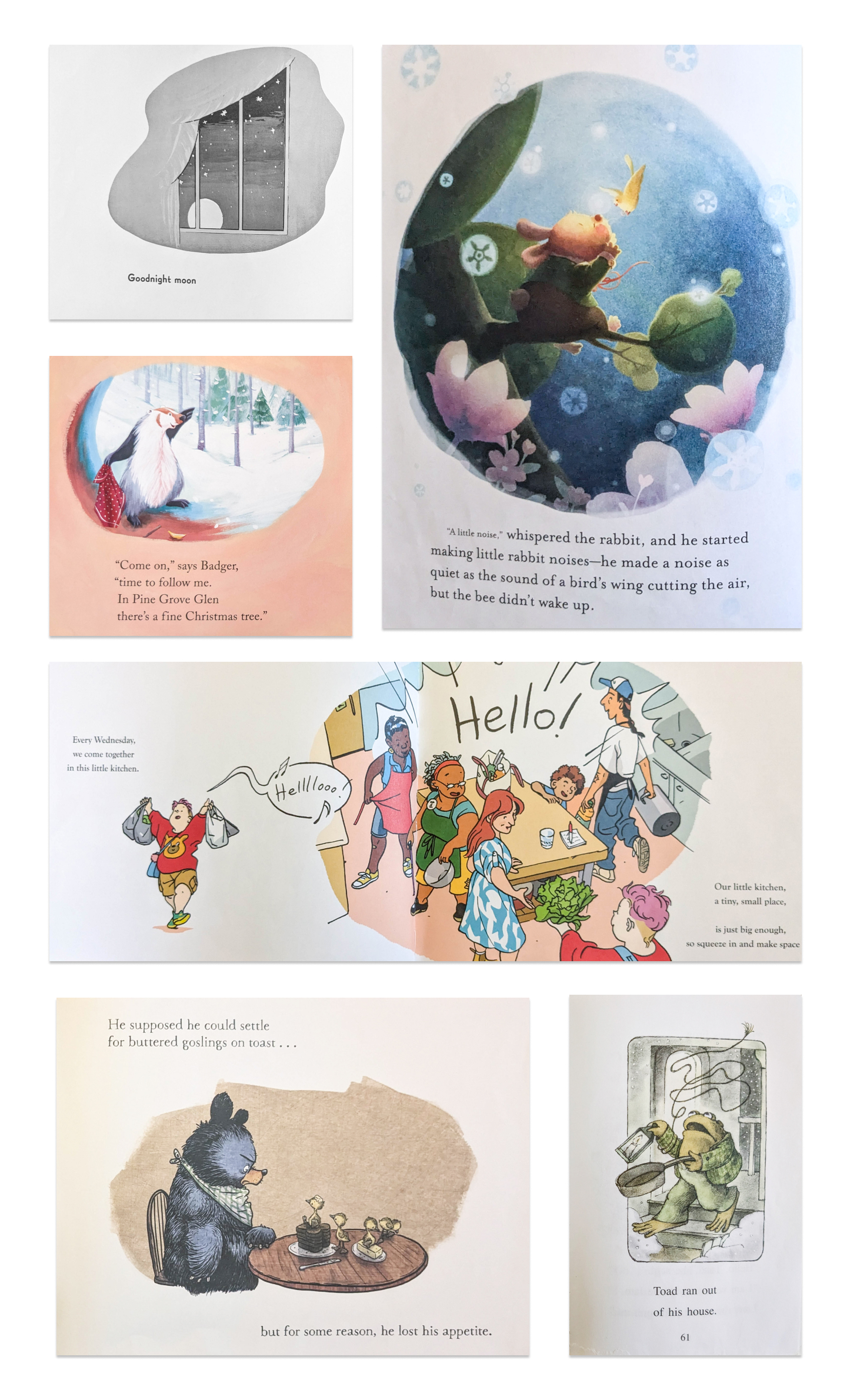
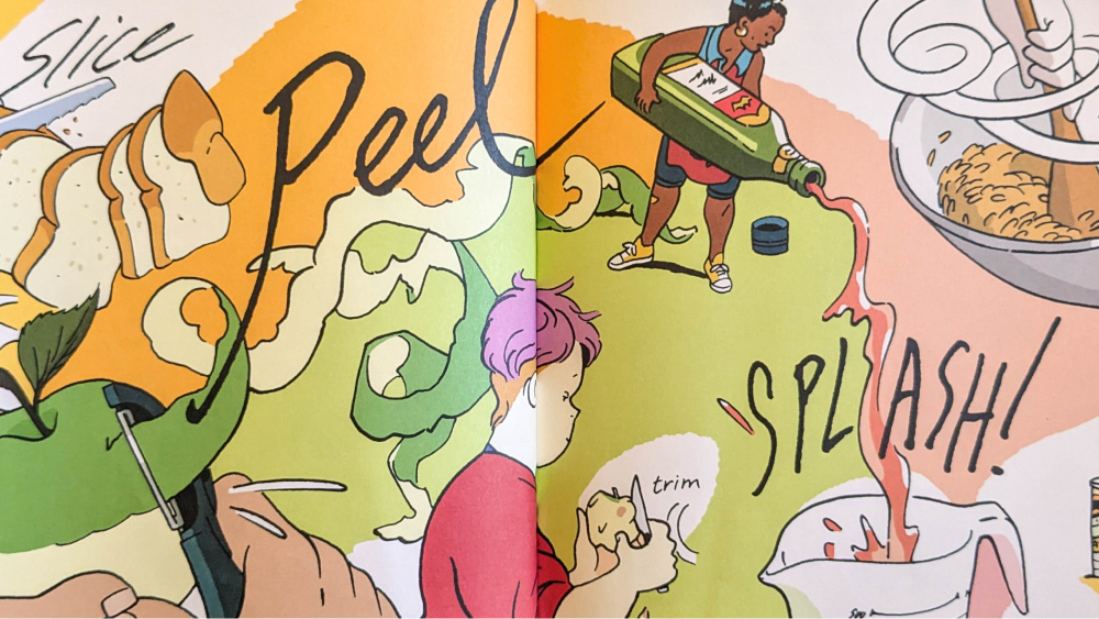
In the third and fifth images above (Our Little Kitchen and Frog and Toad), some characters or objects protrude outside of the frame in a technique borrowed from comics. Breaking the frame adds a sense of drama and movement to such pictures, potentially linking multiple visual areas of the page.
I also love the use of bubbles in the second image from the top (with the badger, from Bear Stays Up for Christmas) because the characters are in a cave and the bubble effectively acts as the cave entrance while not omitting actual spatial renderings of the cave’s architecture.
Another option is to show a small amount of background color or texture, and fade it out into the page background.
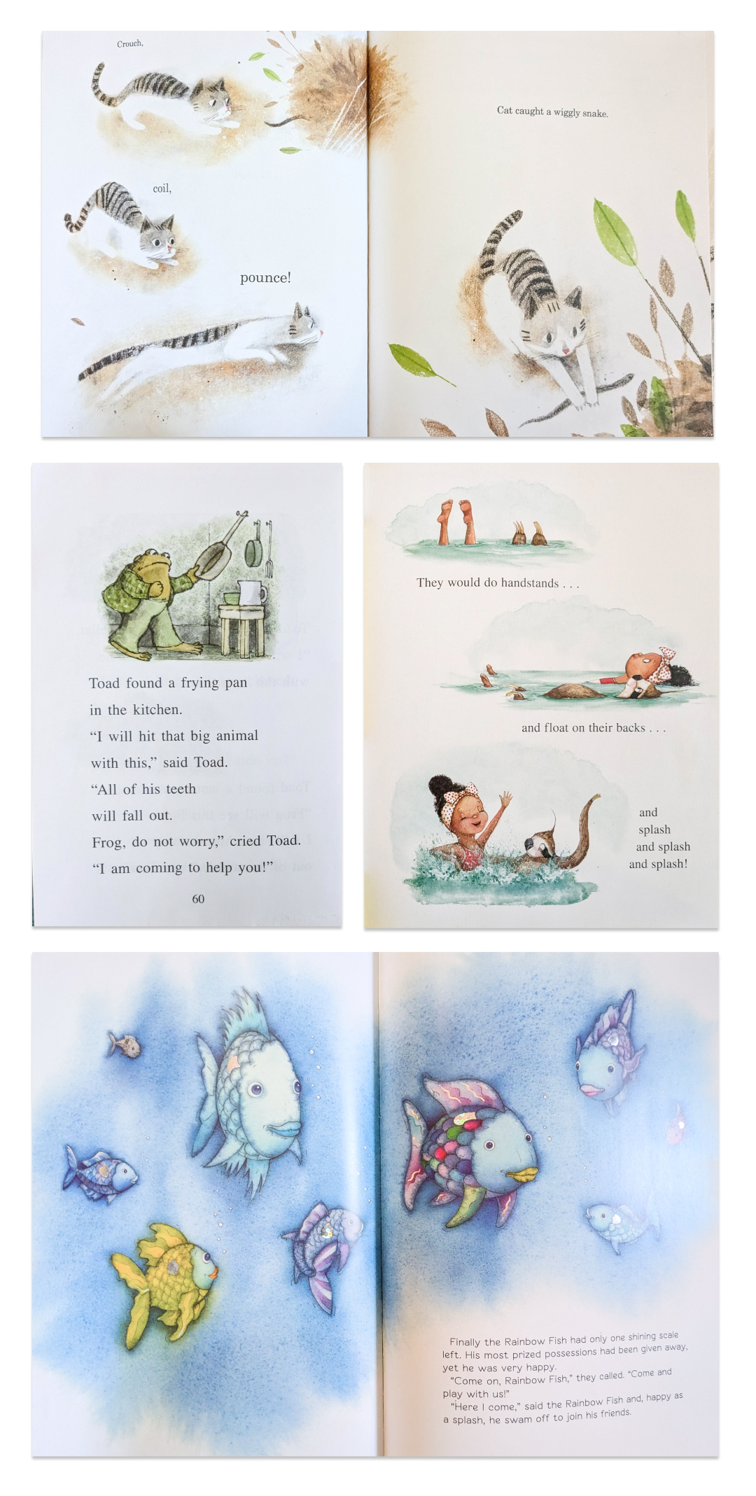
Note the use of a two-page spread in the last image (The Rainbow Fish) and the varied softness or hardness of these “fade-outs.”
A technique to include even more of the environment while still integrating the illustration with the page’s whitespace is to show the foreground only, using selective landscape or architectural details to create a natural “cutoff” for the illustration.
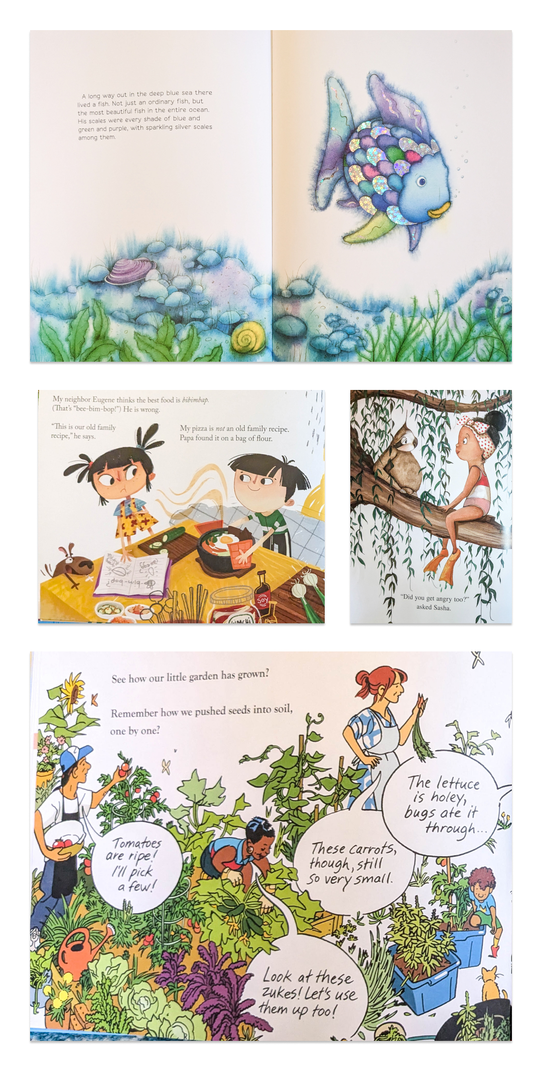
In the examples above, environments are shown with varying degrees of complexity or three-dimensionality, but leave the scene’s “background” as blank whitespace where text can be easily arranged.
Note also the use of speech bubbles in the final image above (Our Little Kitchen). Some books present dialogue with quotation marks akin to a novel, or vary the font to indicate speech. Speech bubbles are another option, and obviously convey a stylistic relationship to comics; they can be an effective way to organize the speech of many characters but require more planning for how to integrate them into the picture.
When the illustration fills the entire space of the page, it’s called a full-bleed illustration. To integrate text in these layouts, the artist needs to anticipate this by leaving empty space devoid of visual details.
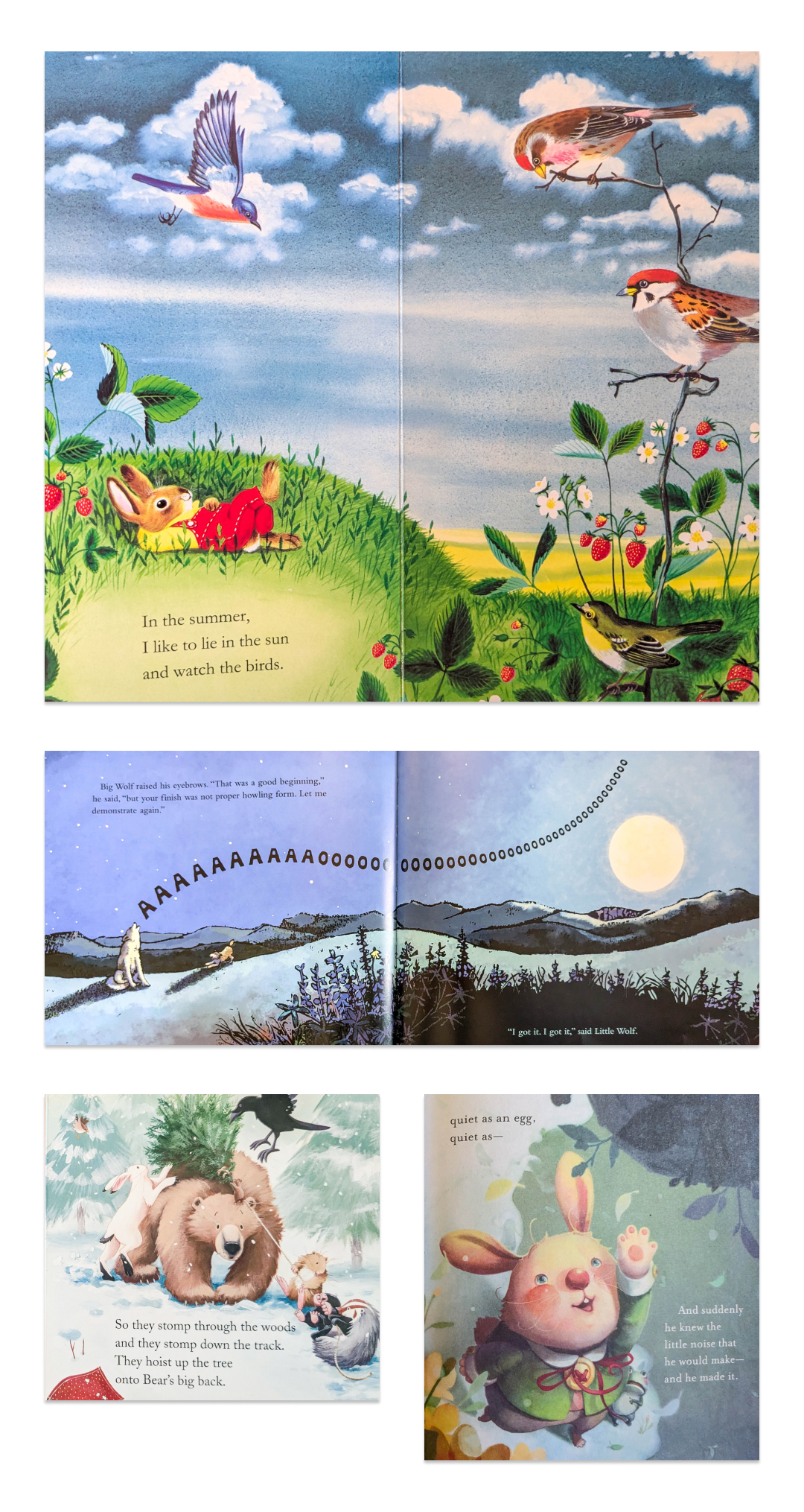
In the second image (Little Wolf’s First Howling) and last (The Whispering Rabbit), note how the text is shown both in black and white to ensure sufficient contrast with the background colors. A risk of this technique is that your text can be hard to read if it’s shown against a color of similar value, imagery, or patterns.
Complex and Unusual Layouts
The use of decorative frames appears in various books, such as the prolific bibliography of Jan Brett, whose The Mitten is shown second below.
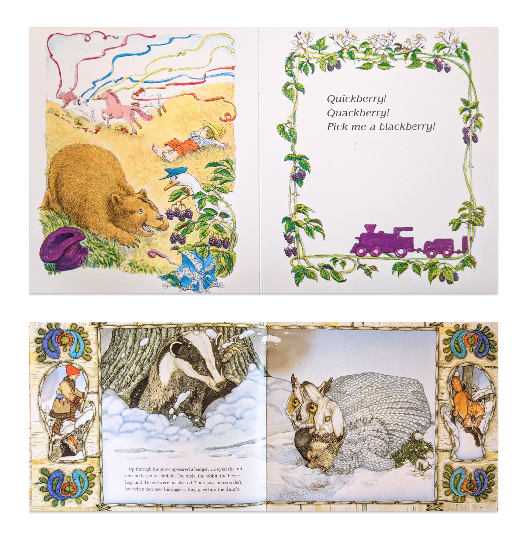
In both of these examples, the decorative frames feature secondary illustrations previewing the events of the next page.
Text can also be presented as overlays, akin to narration boxes in comics. In the example below the overlays are white, but they can also be presented as ripped paper scraps, letters, or digital interfaces through the use of texture and visual details.
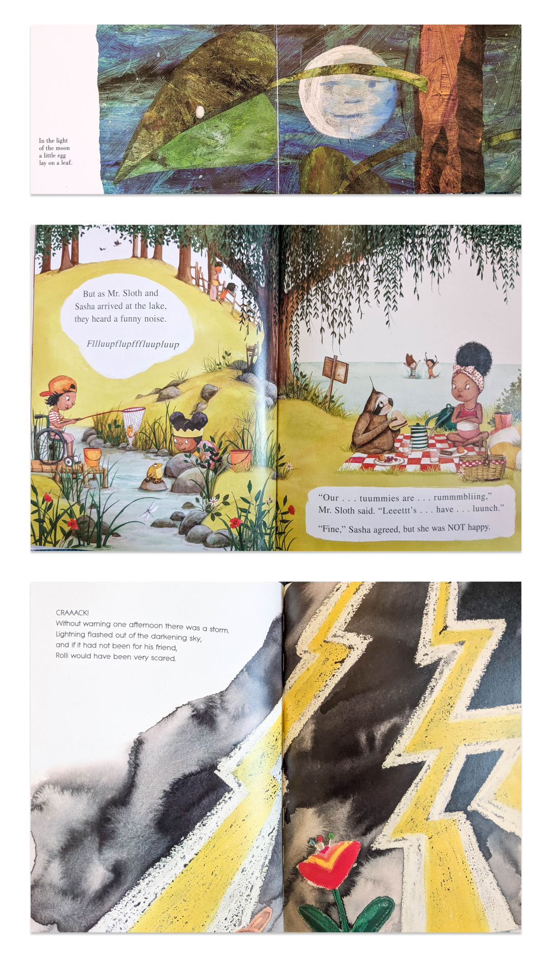
The final image above (Rollie) creates an interesting tension between figure (positive space) and ground (negative space) where the text area feels both on top of and behind the night sky.
Finally the most complex and demanding layout available to illustrators is the all-over montage, so called because it throws a ton of different illustrations together and the reader’s eyes move across the page in cinematic fashion, linking multiple events as if through sequential camera shots. These are very reminiscent of some comic layouts and unlike film, the various images coexist simultaneously, allowing the illustrator to create an overarching composition on the page(s).
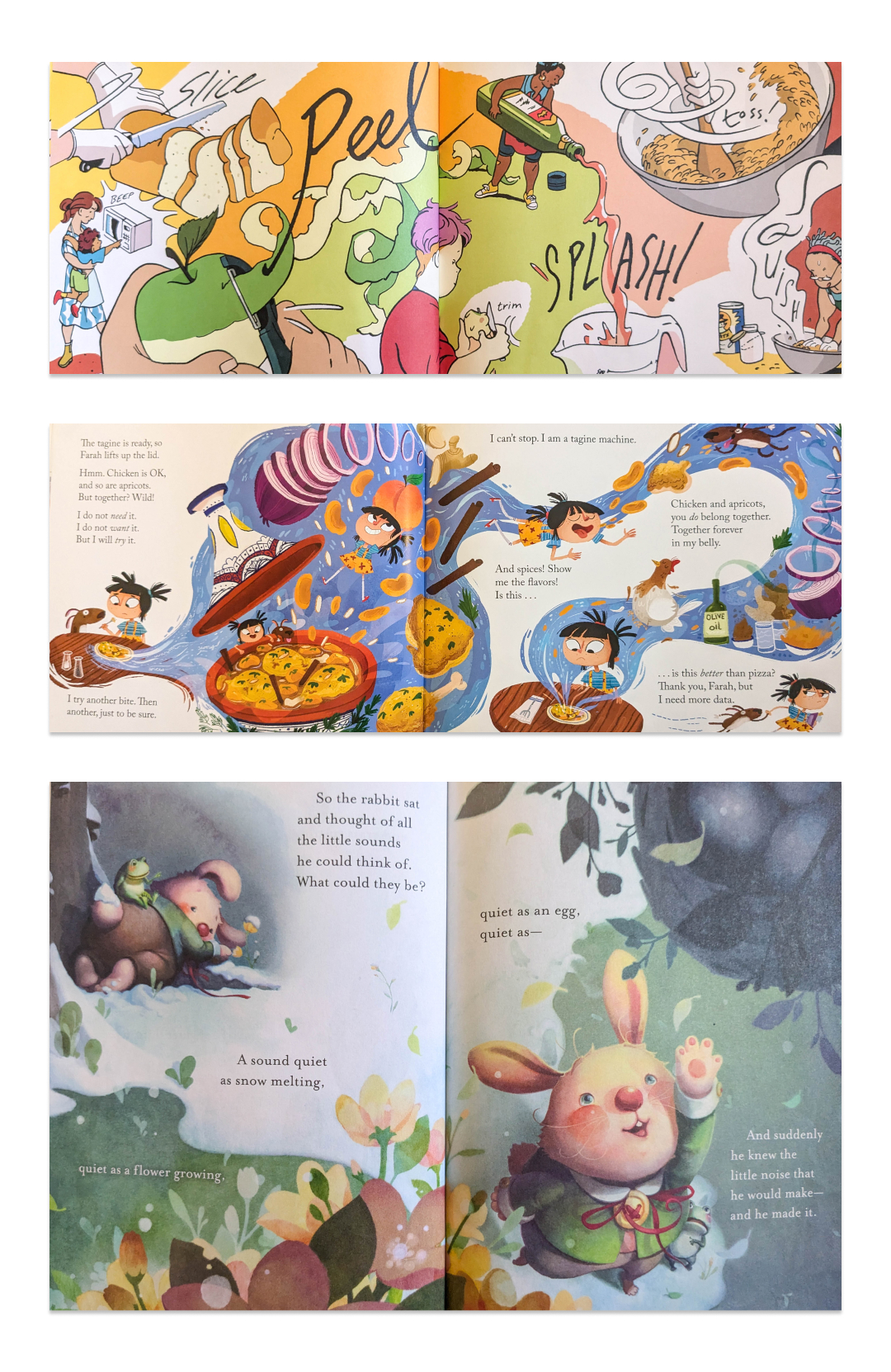
Pay attention to how the background colors create separate “zones” within these spreads and how those divisions are created by objects or environmental details.
Putting it all together
With this survey of page layouts in hand, you can decide which ones to deploy and how to use them in sequence. Reading a book is a time-based experience, and while kids may drive you crazy flipping back to previous pages, a book should be designed as a linear dramatic experience.
Here’s the first half of Where the Wild Things Are, whose illustrations begin as frames with text on separate pages. But as the story progresses and Max sinks into his dreamworld, the frame grows larger on each page, with trees breaking the frame, flips to a bottom text overlay, and then reaches a crescendo sequence of full-bleed pages.

In Maurice Sendak’s commanding visual storytelling, the characters are largely shown as consistent scale (i.e. Max is nearly the same size on every page). This works in concert with the way the environment is drawn, in a kind of stage-like presentation where characters walk along a foreground as if they’re in a side-scrolling video game. I suspect this was done to highlight the artifice of Max’s dreams and present his journey as a linear progression, from his bedroom and back.
But children’s books can be more varied in their framing and use of scale!
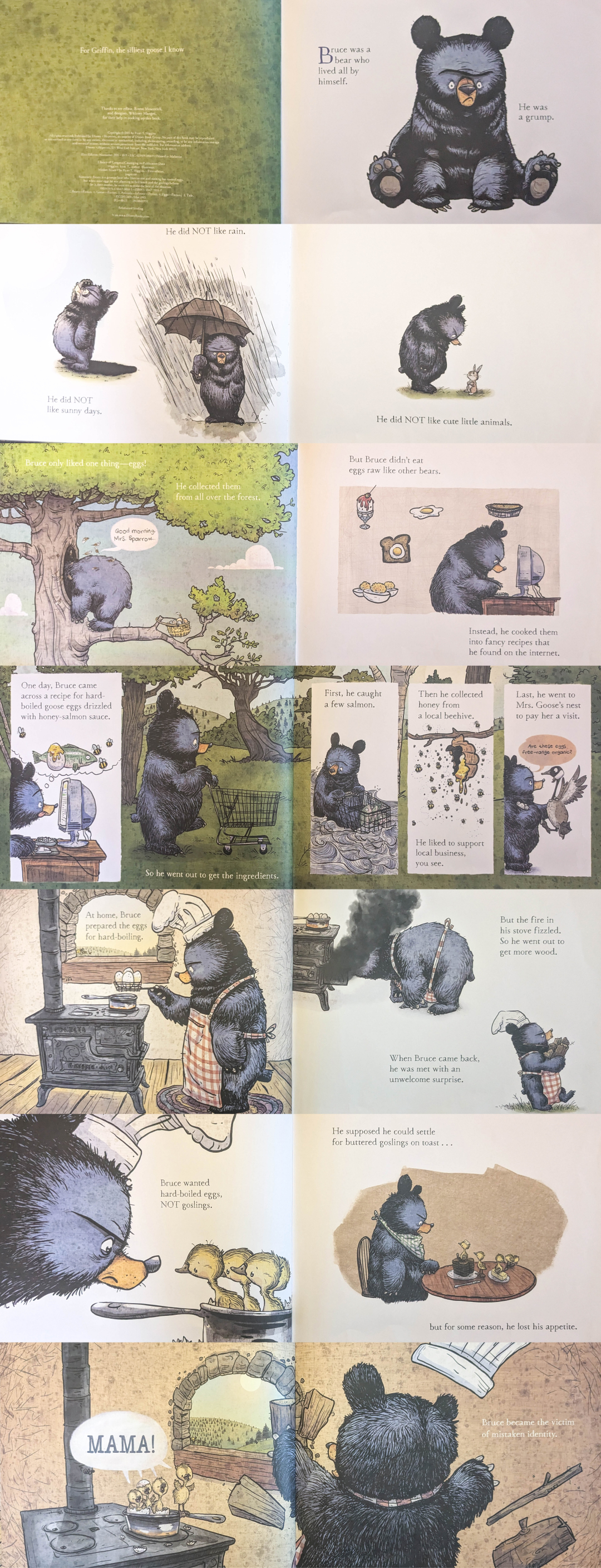
My last example follows a similar rhythm to Marla Frazee’s thumbnail sketches at the beginning of this post, beginning with an isolated character and generous whitespace (a common move to gently transition readers into the world of the story), and using a range of frames, bubbles, overlay illustrations (!), and isolated characters until reaching a full-bleed two-page spread that emphasizes the inciting incident of Mother Bruce.
